Oaks
Classic Old-Style Serif Typography Suite (V3 Elite)
⚡
Crafting an elegant publication title? Your session is auto-saved! Copy the design to your clipboard for instant use.
CLASSIC LITERATURE
#000000
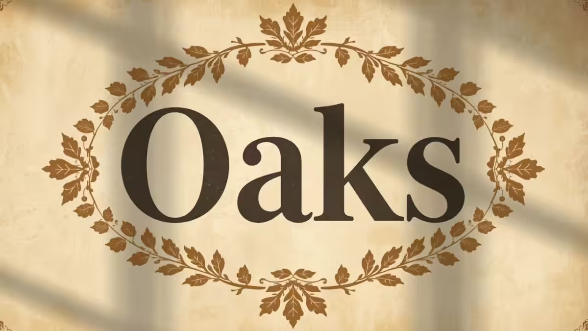
About Oaks Typography
Oaks is a magnificent, elegant display serif typeface that brings classic typography into the modern era with high contrast and graceful curves.
Historical Pedigree
The distinct characteristics of Oaks are inspired by elegant mid-century editorial design and classic book covers, offering a sophisticated and timeless aesthetic.
High Readability
With its sweeping curves and dramatic high contrast, Oaks is celebrated as an exceptional display typeface for luxury branding, elegant editorial spreads, and refined invitations.
Organic Harmony
The letterforms feature a warm, organic rhythm with slightly angled stress axes and subtle calligraphic details, bringing a timeless, human touch to digital publications.
💡 Professional Design Guide
1
Elegant Aesthetic. Oaks shines best with classic monochromatic tones or soft pastels, resembling high-end fashion magazine spreads or premium letterpress.
2
Sparsely Spaced Capitals. For display headlines, book covers, or titles, set the text case to All Caps and increase the letter spacing (10px+) to achieve a majestic, classical monument feel.
3
Renaissance Elegance. Try using the *Silver Silk* effect combined with a *Subtle Depth* shadow to contrast the warm curves of Robert Slimbach’s typeface with a sleek, metallic finish.
Changes Saved!