
Gelasio
Screen-Optimized Serif, Precise & Elegant Editorial Typography Suite
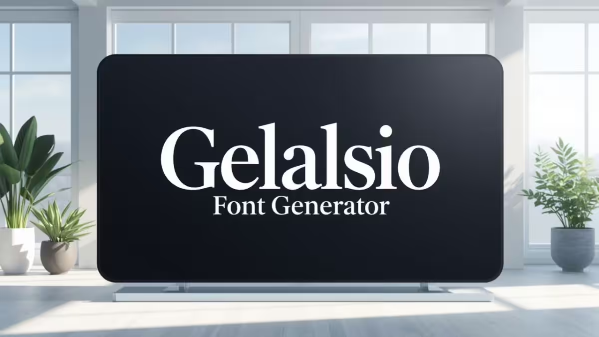
Download Gelasio Font Free
Get the official Gelasio screen-optimized editorial serif font for your personal or commercial design projects.
About Gelasio Typography
Gelasio is a screen-optimized serif typeface designed by Eben Sorkin. It features a medium contrast, generous x-height, and open, clear counters that ensure superb readability on digital screens. Its classical structure is inspired by historical French serif models, rendering it perfect for luxury branding, digital storytelling, editorial publications, and clean blog headers.
Editorial Elegance
Gelasio’s refined serifs and balanced weight curves convey a highly sophisticated, academic, and professional layout aesthetic.
Screen Optimization
Specifically drawn to remain clear at smaller sizes on high-DPI screens, it avoids pixelation issues common in traditional print serifs.
French Serif Roots
Gelasio draws historical inspiration from the classic models of French type founding, carrying a timeless, European-styled elegance.